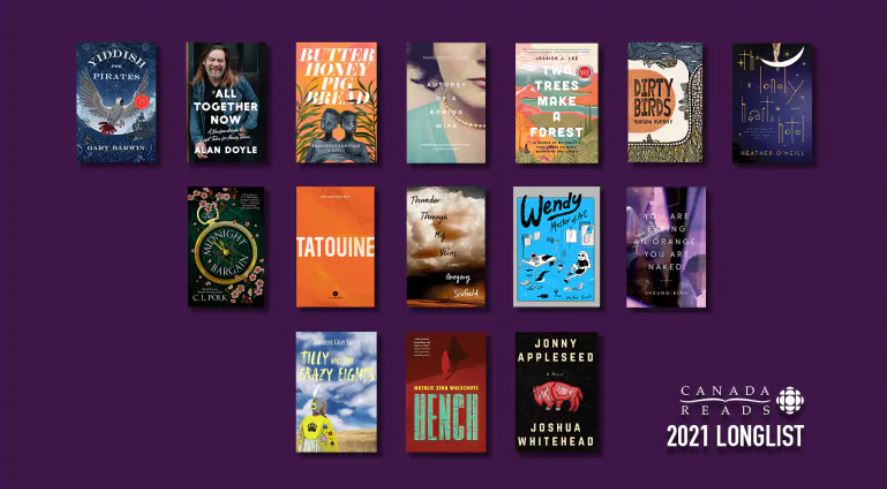
Hey, it’s once again time for Canada to come together in a literary endeavor (minus poetry) to read a single (non-poetry) book that defines us as a nation of (non-poetry) readers and brings (non-poetic) ideas to the fore for us to reflect (prosaically) on who we are as a people (spoiler: not poetry readers). It makes me so proud that I’ve decided to drop the u from colour.
This article at Tor is really just an excuse for me to ramble for a bit about how I’ve been rereading a bunch of genre books I read as a teen and how those books have changed in when passing through my older, presumably greyer, grey matter. Solaris (fantastic and bizarre and how did I even find this book as a kid?), Dune (I just don’t have the zeal to go through it all again), Neuromancer (checks out), Dragonlance (so terribly written that I’m ashamed of my younger self for bearing with them), the various David Eddings books (lists of things that happened with some good moments), The Dragonbone Chair series by Tad Williams (a genuinely great fantasy story), Lord of the Rings (soooo muuuuch weather), the Fionavar Tapestry by Kay (masterpiece), etc. Do they all hold up? No. But do they all tell me something about who I became? Sure. And some books, like Solaris and the Fionavar Tapestry, really offer MORE to me now than they did back then. So it’s not a bad exercise to head back and comb through your personal set of golden oldies.
Live footage from America
I recently found myself combing through some boxes of old books and papers and came across a fascinating personal artifact. On the surface it’s a pretty unremarkable object, just a crumbling spiral-bound notebook covered in childish graffiti. But inside is over a decade of my life—a handwritten list of every book I read between 4th grade and college graduation. Looking through it was a bit like spelunking into the past, a unique look at the strata of different life stages, delineated by changes in handwriting and shifting interests like so many compressed layers of rock.
Paging through the tattered old list, I was seized by a sort of anthropological interest. If different parts of the list reflect phases of my life, what would happen if I took a deep dive into one of these distinct stages and revisited some of those stories? One place in particular caught my interest: from about the age of 12-15 there is a sort of genre bottleneck where my tastes suddenly narrowed from an indiscriminate mix of anything and everything to a very distinctive preference for fantasy and (to a lesser extent at the time) science fiction. There were dozens of titles to choose from, so I picked a handful of stories that conjured up particularly strong feelings, like sense memories that come back clearly even when my actual recollection of the stories is hazy (or nonexistent).
One of the oldest and most in-depth book sites on the net is The Complete Review, home of the Literary Saloon blog… Here’s a round-up of their 2020 posts, if you like meatier books coverage than provided here… Foreign lit and translation is a specialty there… I encourage you to go expand your brain;
Are you a PS4 owner who longed for the days of Neuromancer, but ended up feeling ripped off when Cyberpunk 2077 didn’t run well on your machine? Here’s a list of palette cleanser books (full disclosure, I quite like the game on PC);
This article on punctuation in poetry might interest some of us, but I’d encourage people just starting out to forget about articles like this for about 10 years or so…;
In the second of the new “Bookninja Interviews….” series (in which we ask the people who work with and around writers to make their lives function) we talk to Ingrid Paulson, veteran book designer and now publisher (and perhaps most famously, winner of the Bookninja Cover Redesign contest (as Ingrid Olson?) back in the day), about current trends in design and what constitutes an ideal relationship between authors and designers. Also: who’s actually in charge.
BN: Tell us a bit about yourself, who you are, what you do, and some highlights of your career. IP: I’m a book designer. I design covers and interiors, mostly for trade publishers but also sometimes for academic presses as well as galleries and museums. If that wasn’t enough, a few years ago I started my own micropress, Gladstone Press, where I reissue classic novels with an updated look, great typesetting, printed on premium paper stock. And to top it all off, I also teach book design at Ryerson University as part of their Publishing Certificate program.
I swear, I do have other interests and hobbies outside of books and book design. [shuffles feet]
BN: What makes a cover design that has iconic staying power? IP: I could say a lot of things, but to be frank, there isn’t a formula. The only two things a cover needs on its side are acceptance and time.
So, there’s acceptance. If we see enough book covers that use similar design devices, and also see echoes of those design elements in our daily lives (through advertising, magazines, websites, apps, posters, etc.), then we start to adjust our perceptions and accept certain design conceits as ‘good.’ Are they? Hard to tell when you’re in the middle of the message… That’s why you’ll see certain design ideas used for certain genres to attract those readers (think of the quiet, restrained poetry cover vs a swords and lasers SFF series design, and you get the idea).
And time: if enough time goes by, we reject something we thought was the best design idea, just because we’ve just seen it too many times and crave a change. Then, years later, we switch back and foster a new appreciation for that same aesthetic. We rearrange our visual worldview to say that an old design is particularly pleasing because it is familiar and nostalgic and resonates with us on an emotional level. Who would have thought three-bar Penguin covers would rise to such a cult status? Much less the text-only look used for 1970s Philip Roth covers?
Now, what I just said doesn’t really help anyone out when trying to pick cover A versus cover B for an upcoming title. There are always structural tricks one can use (keep the visual message simple, make sure that there’s a large vs small tension to any object on the cover, use a Z-curve to orient elements on the page, etc. etc.), but those are just tools.
How about this? If the visual message is muddy, the cover doesn’t have legs. Pretty simple. So long as the design composition intrigues us before we start the book, and doesn’t let us down once we finish, it’s the right design for the job.
And if you want to stand out? If all the other book designs look like they are shouting, make sure yours whispers. And vice versa. People notice differences more than they notice sameness.
BN: How are current trends in design shifting? IP: The past few years there’s been a bit of a revolving door between Instagrammable cover designs (huge title text, wallpaper/colour field backgrounds that look great at small sizes on a screen) and the handmade look (handwritten titles, cut paper/guache/watercolour illustrations that remind readers that books are physical objects). We’re going to see those trends for awhile, but there’s a backlash brewing: I’m starting to see more collage and tight, blink-and-you-miss clever concept imagery tucked into corners. A bit of quiet in the storm.
Also, designers are still in thrall to juicy, bright multicoloured palettes. Readers crave technicolour escapes, I guess?
BN: What help can an author provide in the design process? IP: Most authors understand that the cover is a marketing tool and leave the designer to do their thing, which is great. It can help to suggest an image or two, particularly if they inspired the author while they wrote the book – I remember it was you who suggested Steichen’s Lake George photo when I was designing your book, The Cottage Builder’s Letter. That was very helpful! But original artwork doesn’t always work on a cover, mostly because the artwork has to act as a visual to sell the author’s work first and foremost. So, suggest, but don’t insist. It may not be the right image for your book, much as you love it.
If as an author you’re asked to fill out a cover design questionnaire, don’t let it overwhelm you, especially if you have no ideas or don’t feel you’re visually astute. Just try to say a few things, mention a few similar books to yours if you can, and because it’s your book, do mention any things you hate to see on a book of yours (if there’s anything). It’s your work, after all. But don’t get bogged down in type choices or suitable colours – usually your own writing will tell a designer all they need to know about mood, setting, colour palettes, symbolism, that kind of thing.
BN: Whose opinion matters most to a designer: the author’s, the editor’s, the marketing team’s? IP: I…I…I can’t answer that. Whomever is in charge? [hides]
BN: If you could have people know one thing about design, what would it be? IP: Design’s purpose is not about making something pretty for pretty’s sake, nor should a cover be illustrating complex plot points in excruciating detail. Design’s sole purpose is to communicate something intriguing about the book so a reader picks it up. Everything else is gravy.
Well, I took the holidays off Bookninja to start my own online poetry school. I am realizing now that I probably should have either begun this sooner or set the start date later, but thankfully, things are coming together for the first course start date, a week from today. Check it out, if you like. Otherwise, I’m getting back to the news. I probably missed a bunch while Giftmas raged, so if there’s a story you think I should highlight, please hit that Tips link in the upper right corner. I’ll try to start the year with some happier news, then I’ll let it descend into the pit of despair that is reality in as gradual a fashion as I can manage;
20 New Year’s poems to start with hope… Stuart Ross sends out a new poem every Jan 1… You should get on that list if you can… I’ve been collecting them for 20 years or so, and they’re lovely to wake up hung over to… Waiting for the book, Stu;
A book club for procrastinators, but you know, you have to read the article first to get around to learning about the club and maybe changing your life for the better, but man is this chair so comfortable and perhaps you need a new coffee;
Well, I handed in the final draft of my book yesterday and am waiting for the copyeditor to make sure I look like less of an idiot than I am, so it’s time to officially celebrate and begin the long, agonizing process of worrying about what I have done. Nine or ten months from now, a book will appear with my name on it and everything I did wrong will be standing out in bold type that only I can see. Well, not only me. I’m sure there will be a kind critic or two out there that will helpfully point out my foibles in a public venue. But hopefully there will be a reader or two that will go past all that into whatever it was I meant to say and find it jives with whatever it was they always meant to say as well, and the circle of life will continue. It’s a very glamorous literary life. Now I’m off to Costco to buy cheese and a barrel of mayonnaise. Have a good weekend, common folk.
When I wrote Devil I had a simple thought in mind. I wanted to tell a story about Los Angeles that highlighted black life and the black contribution to culture within a mirror-darkly that partially reflected the American experience within a shadowy landscape of national shame. In that book I talked about how poor black people migrated from the Deep South to Southern California, of how they flourished and ultimately failed; only to rise again, flourish again, fail again but in the end, pressing the envelope of that contest forward each and every time.
Sometimes within failure is contained magnificence. The characters introduced by the Easy Rawlins series hopefully displayed glimmers of hope and resistance.
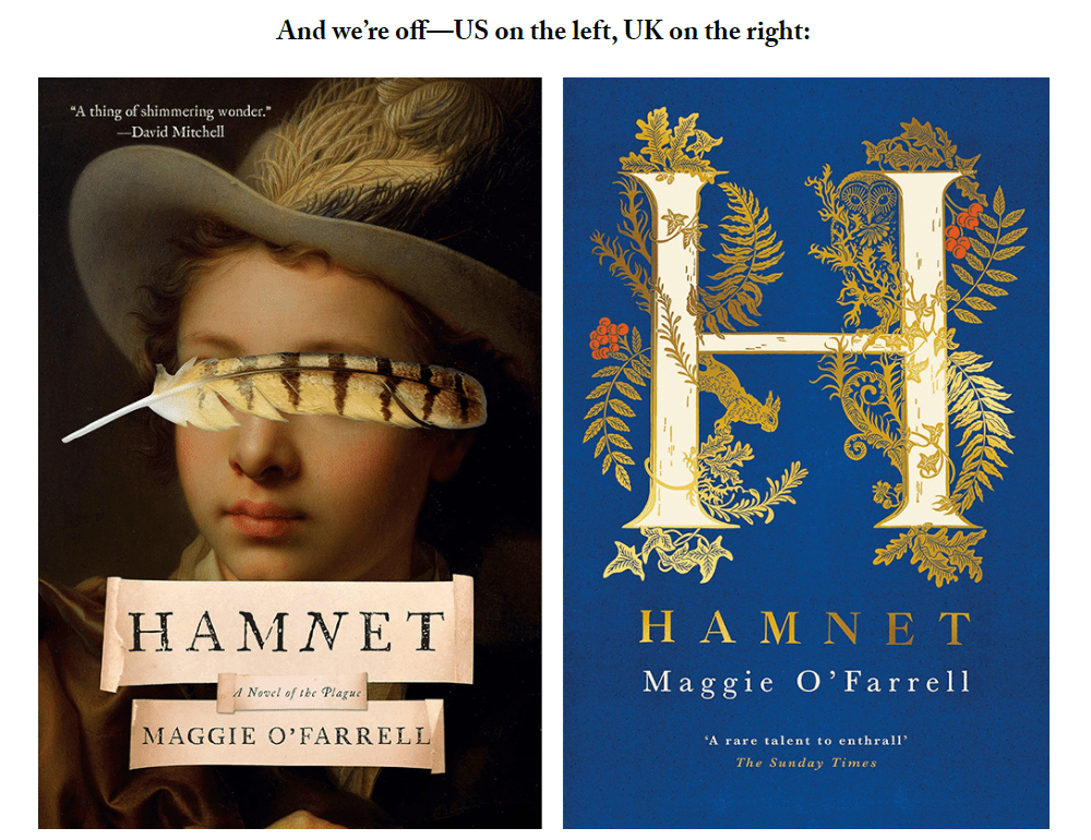
…comparing US and UK covers; it’s fascinating to see different designers’ takes on the same book—and because the UK is most closely linked market to ours, there are plenty of opportunities. It’s extra fun at this point in the year, when we’ve seen some of these covers hundreds of times, and they’ve reified in our brains as being synonymous with the book itself; it makes that previously unseen version feel all the more exciting. It’s like seeing a good friend in a fresh new haircut. Or a fresh new face. But not in a murder-y way. So here are a few American book covers from 2020, side-by-side with their across-the-pond counterparts. Which ones are better?